Enter password to view this case study

Team: 2 designers, 1 PM, 6 engineers
Role: Lead Product Designer
Software: Figma
Duration: Sept 2025-present
eden is an early-stage startup building the future of creative work. It's the first platform that makes your imagination searchable, your AI workflows visual, and your past learning instantly actionable.
The problem
Beta testing revealed that their initial interactions with Eden didn’t effectively communicate the product’s core features or guide users through the setup process. Important sections were too hidden, and users described the layout as confusing.
The design challenge:
🗣️ How might we make users' first-touch experience with Eden more intuitive, surface key actions, and help creators immediately understand how to engage with their workspace?
My design process
user flow — design audit — design exploration — handoff — beta user testing — polish + design system
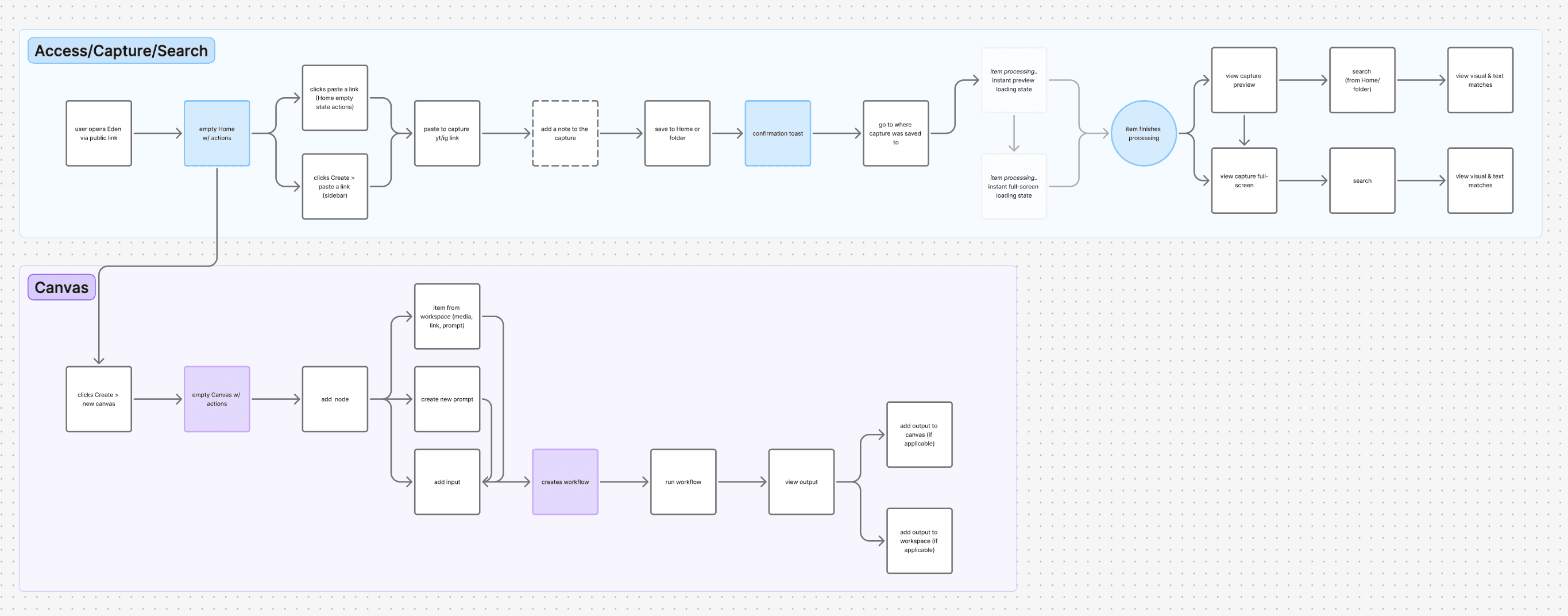
Being an early-stage startup, our team had many ideas, and limited time to design and ship out features. Using FigJam, I mapped our first-touch experience flow and worked with our PM to narrow it down to a basic flow that supported core user workflows, like Search, Capture and Canvas for the MVP.
For the rest of this case study, I will be focusing on the process surrounding the initial landing Home page experience.
Design audit ✍️
After creating the user flow, I conducted a quick design audit of our existing homepage (i.e. what our users see upon landing in Eden). I was focused on identifying usability issues, visual inconsistencies, and opportunities to guide users to discover the capabilities of Eden.
PREVIOUS DESIGN

Iterate, iterate… and iterate!
After going through user feedback and noting down the areas for improvement, I held a crazy 8's design ideation session with our other Product Designer to rapidly generate ideas on how we could improve the existing Home layout.
Following the ideation session, I synthesized our sketches, did some more design exploration (below) in Figma and turned our sketches into mid-fi screens, then met with the PM to align on a feasible design direction to move forward in.
HOME LAYOUT
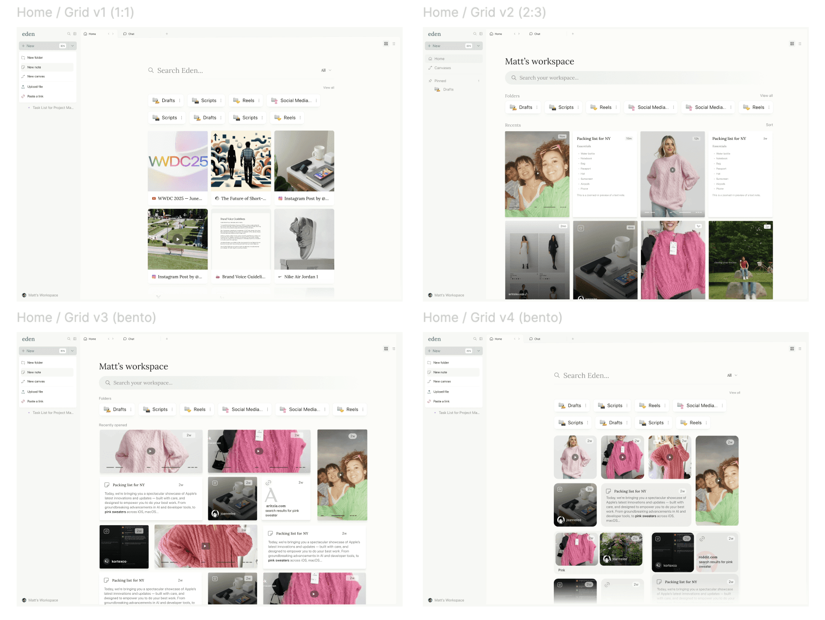
explored ways to make the layout more visual, prioritizing users' uploaded content and maintaining folder hierarchy and organization
QUICK CAPTURE
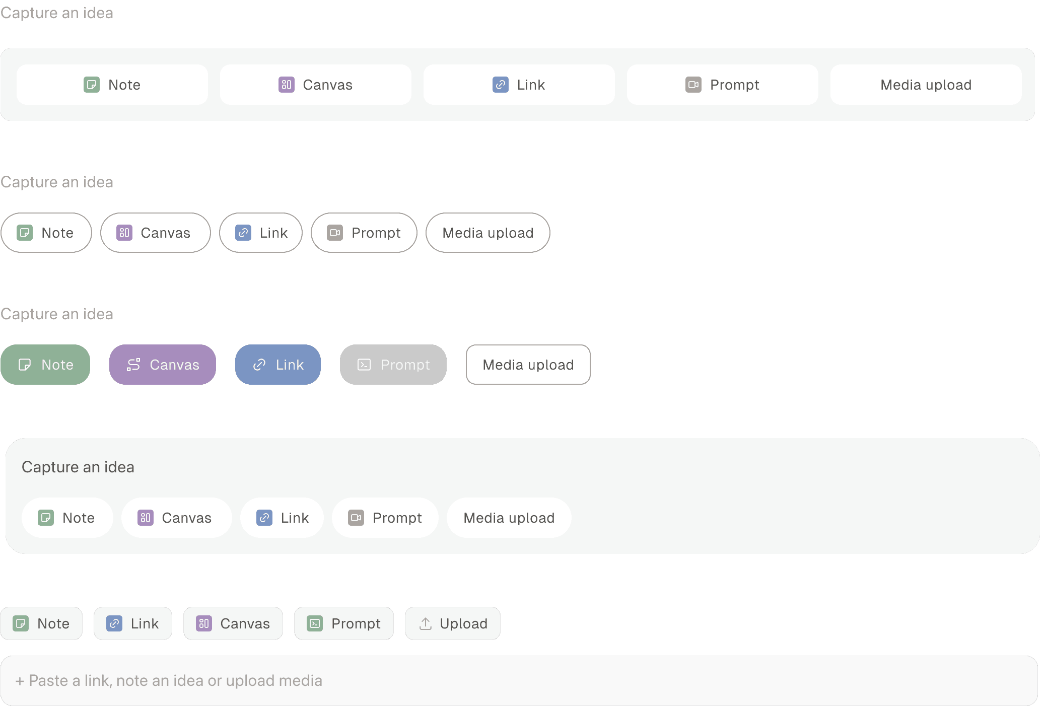
explored ways to reduce confusion and # of clicks to access and use the quick capture feature
SIDEBAR LAYOUT + NAVIGATION
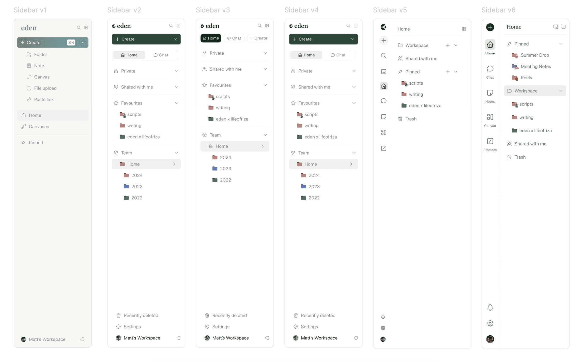
explored ways to improve visual hierarchy in sidebar + display users items organized in an intuitive way
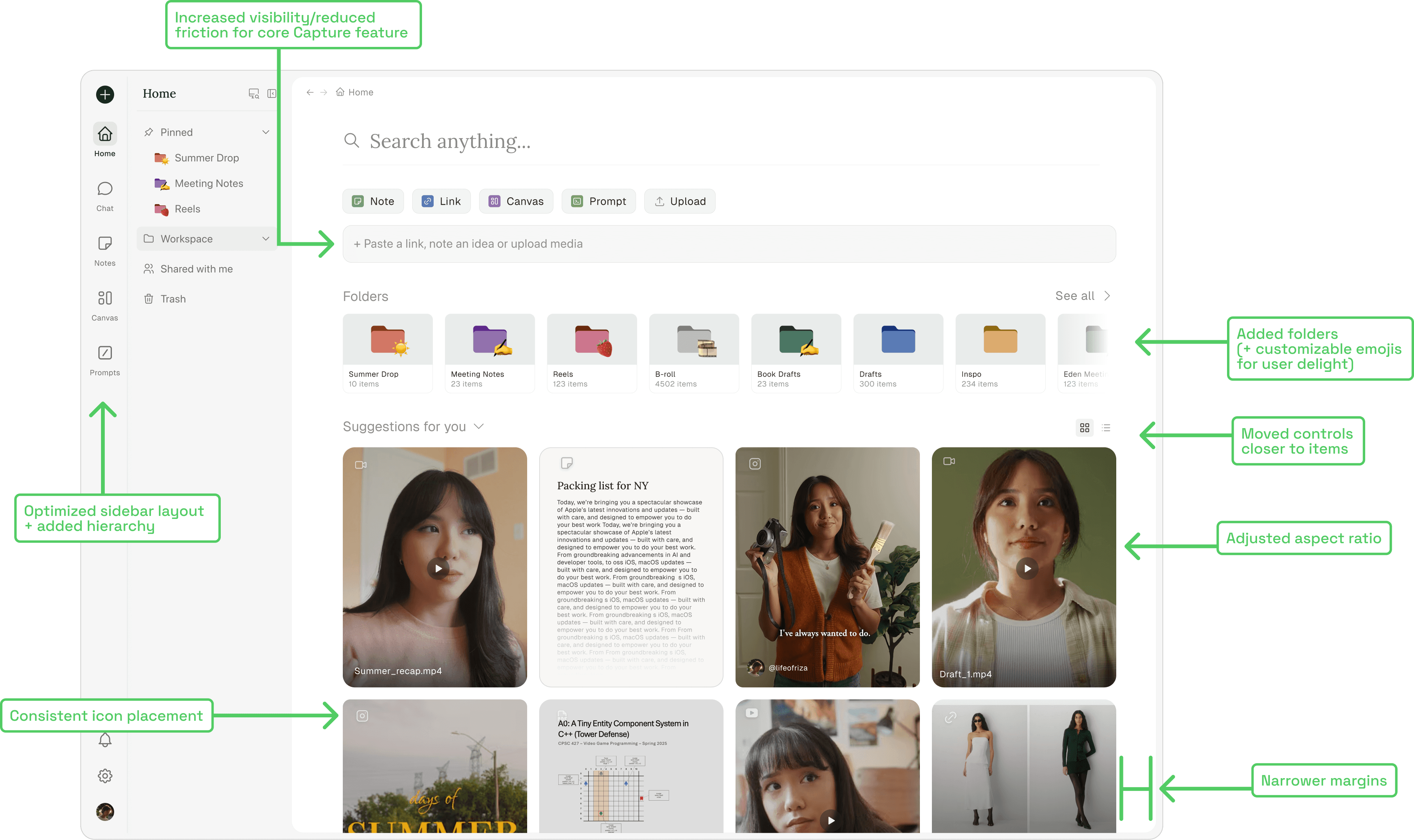
The final design (for now)
I presented a few potential variations of the new Home to our PM, CEO and engineers. 👩🏻💻
After lots of discussion weighing the pros and cons of each design, and re-visiting user feedback, we decided on the following Home screen design.
UPDATED DESIGN
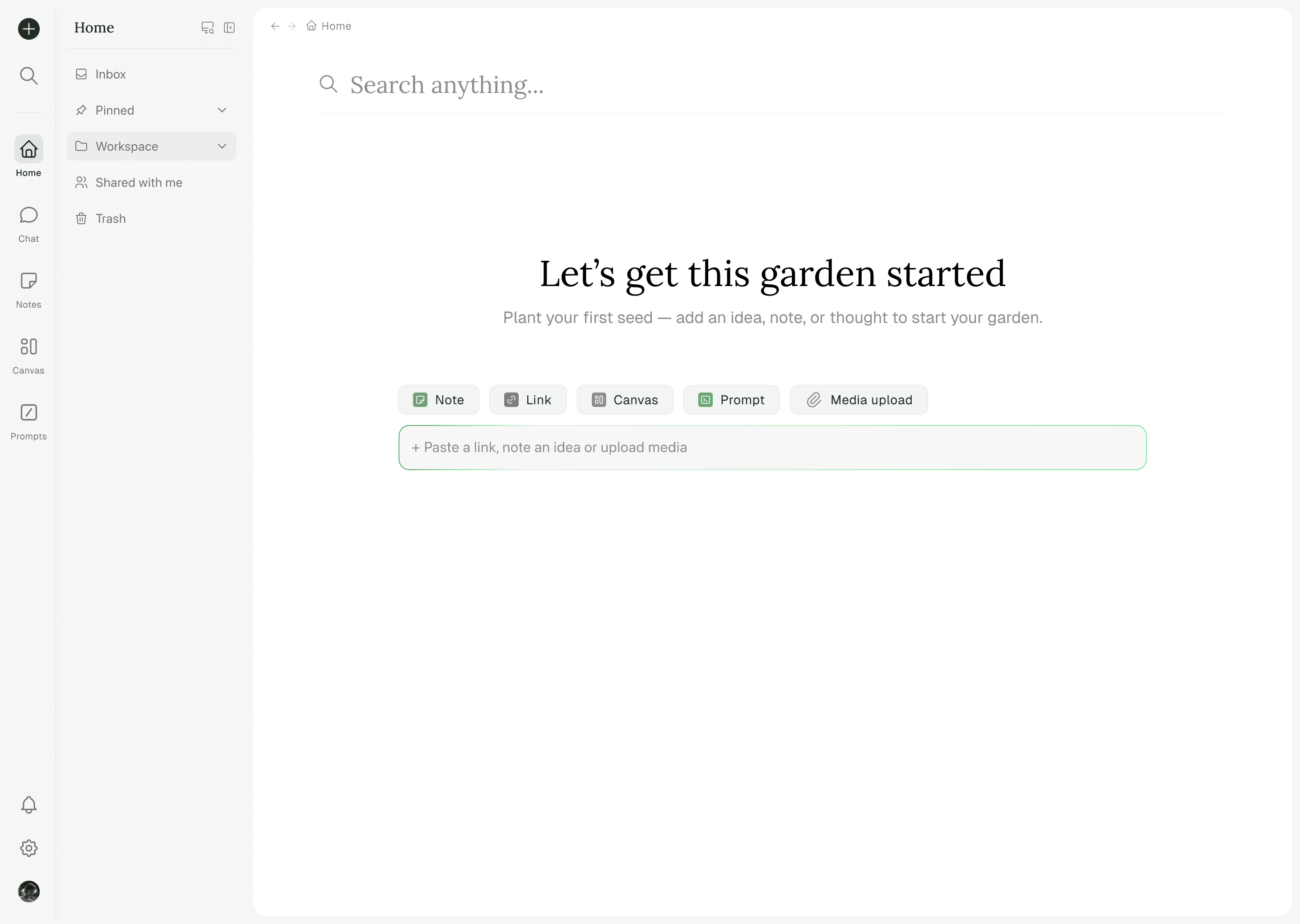
Wait.. what if there's no content?
After handing off the new Home design, I quickly realized I hadn't yet solved for the real first-touch experience: the empty state. Building upon the new design, I designed an empty Home state that maintained core features while having a clear CTA visible to our users, enabling them to hit the ground running.
This empty state is also present when users create a new folder, where previously they were met with a blank screen.
What did our
beta users
think?
The new Home was recently implemented, and while we’ve only heard back from a handful of beta users so far, the feedback has been overwhelmingly positive. Users mentioned that the layout feels cleaner, navigation is more intuitive, and the content feels more "front-and-centre to the app". Although it’s still early, these initial impressions suggest we’re moving in the right direction. We plan to continue gathering feedback as more users interact with the new experience. :)
What's next? 👀
Now that our product team and users feel confident in the new design direction, I've been working on building out Eden's foundational design system in Figma. Beyond improving consistency, the goal is to empower the team to design, prototype, test, and ship new ideas more quickly while maintaining a strong, recognizable brand identity. And, ensuring everything is pixel-perfect.
As Eden continues to expand, this system will serve as the backbone for our evolving product ecosystem. ❇️